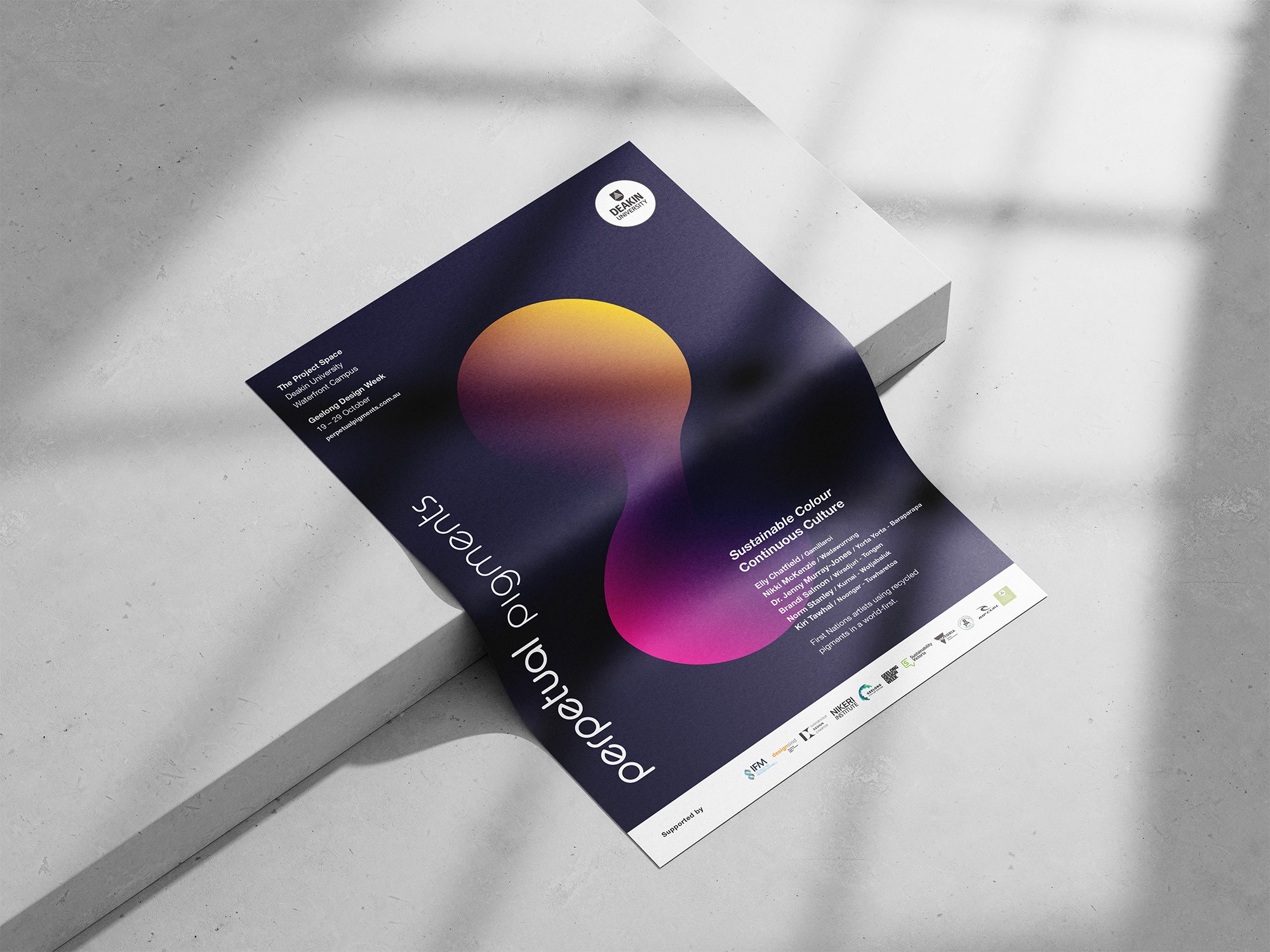
What happens to the colour locked inside the clothes we throw away?
Deakin University
2023
Outcomes
The project
Perpetual Pigments began as a research collaboration between Deakin University and the Institute for Frontier Materials, backed by Sustainability Victoria and Rip Curl. The research question was a material one: discarded textiles are a significant waste stream, and the pigments locked inside them are usually lost. Could those pigments be recovered and given a second life?
The project needed an identity that could carry that idea into the world: a brand, a website, an exhibition catalogue, and supporting collateral. It needed to be done under the guidance of the International Indigenous Design Charter, engaging First Nations knowledge and practice with appropriate care.
My role
I was sole designer across the project's public-facing identity. I owned the brand identity, designed and developed the website, and produced the exhibition catalogue, marketing collateral, and a web-based animation. The research and material science sat with Deakin and IFM; translating that work into something the visual arts sector could see, understand, and engage with was mine.
Working under the Charter
The project engaged with First Nations knowledge, which placed a clear obligation on how the design work was conducted. Rather than treating cultural engagement as a box ticked at the end, the project was run under the International Indigenous Design Charter from the outset.
I worked directly with one of the Charter's authors to ensure the design process was charter-compliant, and held consultations with a First Nations representative throughout the project rather than as a single point of sign-off. This was a governance layer — it shaped how the work was made and ensured the project engaged with First Nations knowledge respectfully and appropriately, with the right people involved at the right points. For a project drawing on cultural knowledge, getting that process right was as important as any design decision.
Designing the mark
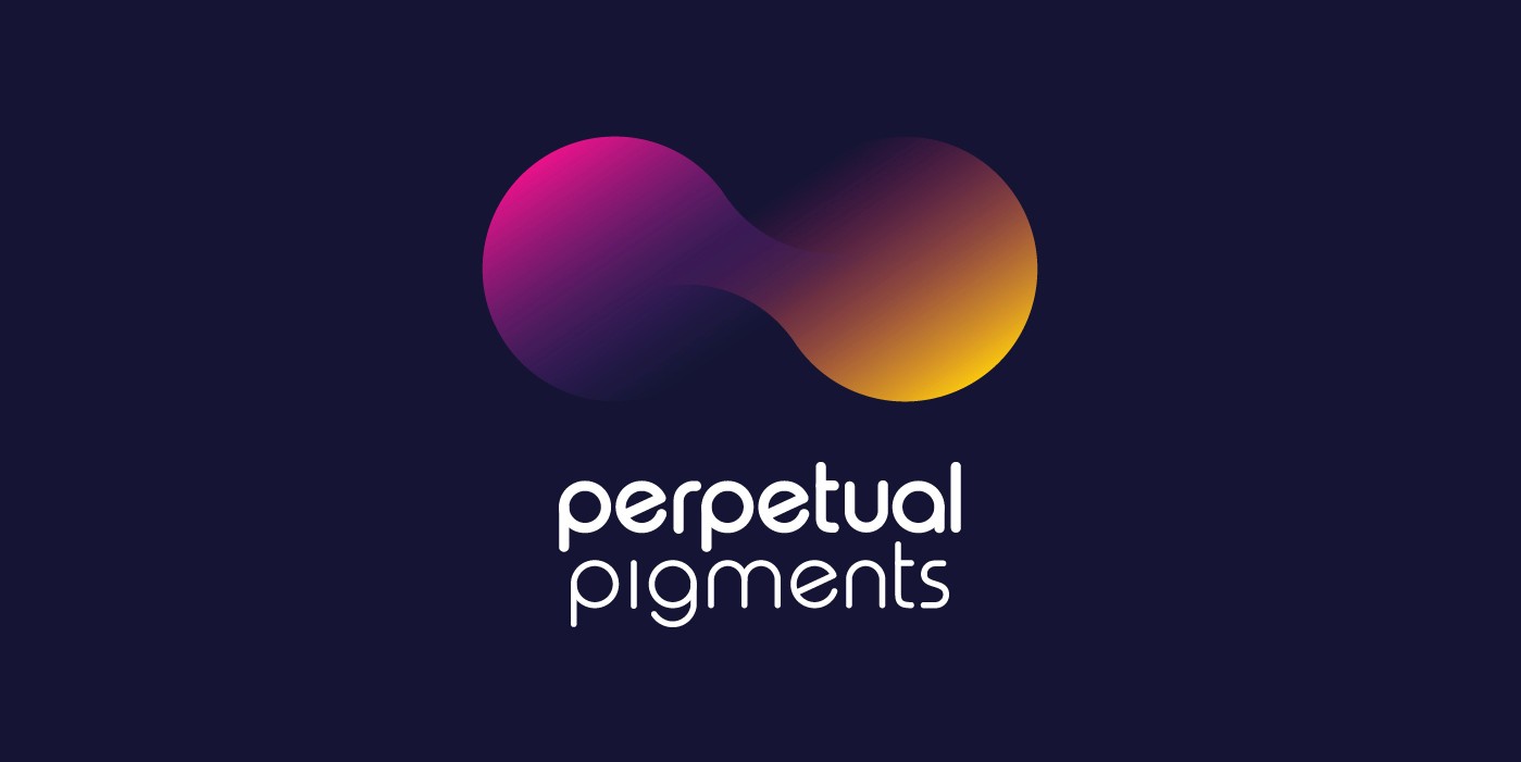
A project about recovered colour needed a mark about renewal, not waste. The temptation with sustainability branding is to lean on the visual language of recycling — arrows, loops, the familiar iconography of the green movement. That would have said sustainable without saying anything about colour.
The identity instead works from two ideas at once. The mark reads as an infinity symbol — colour that never reaches an endpoint, that cycles continuously from one life into the next. And it reads as pigments blending: two colours meeting and forming something new, the way a paint palette is a place where old material becomes new work. The form holds both readings. It's a statement about sustainability and a statement about colour in a single icon, which is exactly what the project itself is.
A mark that moves
A static symbol could show the infinity form, but it couldn't show the continuousness — the blending, the shifting, the idea that this is a process without a fixed endpoint. So the mark was designed to move.
The animation cycles colour continuously, fading from one hue into the next with no hard transition and no resting point. It moves in and out of focus — blurring so there are no hard edges, then resolving, then softening again. Nothing about it ever settles. That restlessness is the point: Perpetual Pigments is a cycle, not a product, and the mark behaves like one. The animation isn't decoration applied to a finished logo — it's the logo expressing the idea the static form can only imply.
The website
I designed and developed a mobile-responsive website to host the project and support the exhibition, built in WordPress and hosted through Deakin to meet the project's compliance requirements. The design uses generous whitespace to keep the project feeling contemporary and to let the work — the pigments, the stories, the artwork — carry the page rather than competing with it. A blue-purple is the primary colour throughout, giving the digital experience a consistent spine while the artwork supplies the colour range.
The site was built to be accessible, so the project could be explored by anyone encountering it outside the physical exhibition.
The catalogue
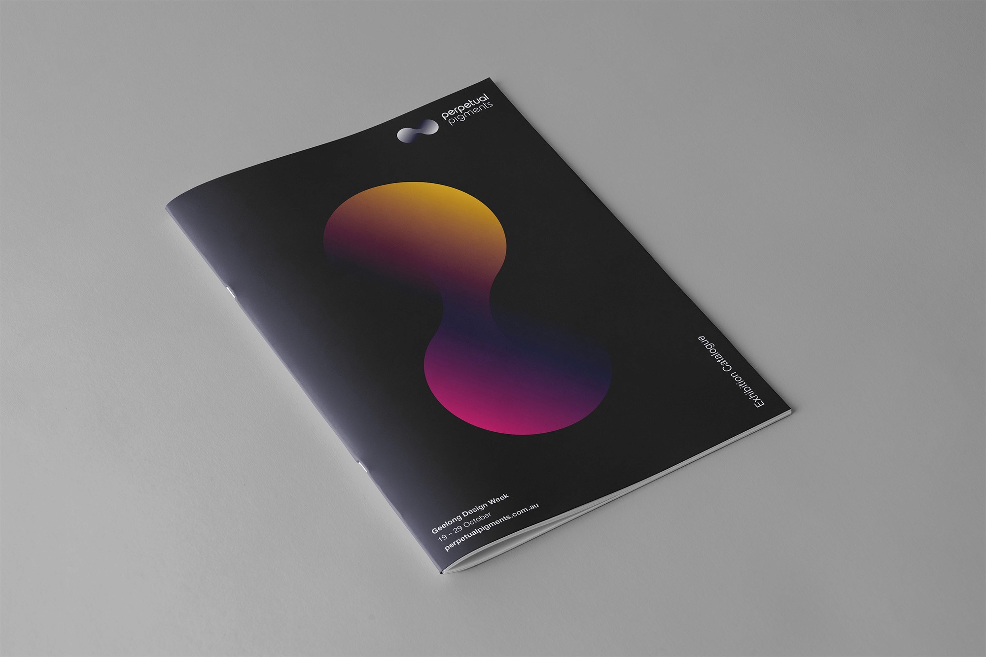
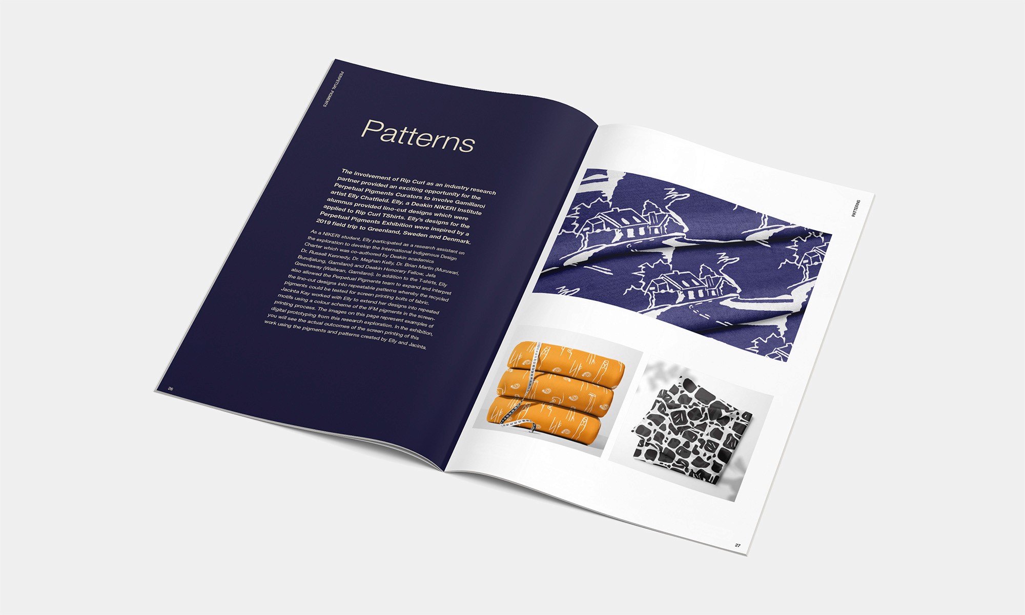
The exhibition catalogue was printed locally in Geelong as a premium piece. Where the website holds a restrained primary palette, the catalogue uses bold colour throughout — appropriate for a printed object whose entire subject is pigment. The same generous whitespace carries across from the digital work, keeping the catalogue contemporary and giving the artwork and the stories room to speak for themselves.
For the opening of Geelong Design Week, I designed a companion mini-brochure — and built one idea into it that the catalogue couldn't do. One page carries a brushstroke of the actual recovered pigment, hand-applied, so every visitor could take a physical piece of the project's material away with them. The thing the project is about, in their hands, not just described on a page.



Reflection
Knowing what I know now, I'd build a set of brand guidelines as part of the deliverables. The identity has had a life well beyond the original exhibition. The project continues, and the brand continues with it. A documented system would let it be applied consistently by anyone picking it up in future, without the original design rationale having to be reconstructed from memory. The work was made to last; the documentation should have been built to match.